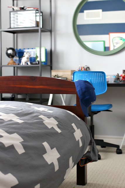
Here's the before:
And the after:
Orange pillow - HomeSense//Orange paint on frame - FAT Paint (c/o)//Bison Print - Anewall//Green Frame - IKEA//Bedside Table - IKEA//Lamp - HomeSense//Bedding - Aura Home (c/o)
The primary focus was to spend little money (ha, truth) and to make the room more efficient and keep an airy feel. We changed the layout, to keep from having every single piece of furniture pushed against the walls. I purchased a pair of the ever popular Vittsjo shelves from IKEA to flank his desk (also from IKEA). I chose to remove the glass shelves that came with the units and replaced them with wooden ones, which I stained after having them cut to size. Truth is, I thought I could get away with wood shelves that were the same width as the glass, the next size up would have left a little bit of a lip above the frame. Of course, there's a bit of sag now because the wood isn't strong enough to hold heavier items. We just work around it, not stacking a slew of books on one shelf, etc. So it's not awful, and we could add some support in the centre of the shelves, but just so you know if you chose to go that route as well.
We kept the desk & chair that he had before, they work, but I'd love to eventually replace both for something vintage, maybe even just the chair. The bedding from Aura is super cozy. I love the pattern and especially love the orange piping, a colour that we ended up carrying throughout the room.
The biggest change was by far the stripes. I am SO happy with how they turned out! I was extremely nervous, but after testing out over 5 paint colours, this blue was the one and boy does it ever add a great focal point to the room. I also love that you can see it in the mirror when you walk into his room. Speaking of the mirror, I chose to hang it above the desk for that exact reason, to make the room feel a tad bit bigger. Does the job!
My favourite decor piece in the room is his very first baseball glove. Oh my heart. I picked up the case from Michaels. We are a big baseball family (hence the hats on either end of his bed!) so we had to include touches of baseball in the room.
We bought the dresser, desk and chair when we first moved into the house. I now wish I had waited and purchased a dresser that was shorter and wider, like this. It would provide him with more space to display items, with the larger top. I also think it wouldn't have such a "heavy" feel to it.
I still need to switch out the lighting and hang up some awesome blue hooks that I picked up (they'll go behind his door). They will give him a place to easily hang up sweaters or hats vs placing them on his bed. The bed frame could have gone, but there's nothing wrong with it, so it stays for now. A little more art to hang (sports related, of course) and then that's that!
He's so happy with it, there's a bean bag chair on the left side of his bed where he loves to hang out. I'm happy that he's content with the space and finds it so cozy. Now to move onto the other kidlets' rooms! Hopefully it won't take me as long to finish! oy!
Cheers,


I love what you did with the shelves and the strikes turned out awesome. Did you have trouble with the paint bleeding? I worry about that.
ReplyDeleteKate
Love everything about this room! You did a wonderful job. I like how you incorprotaed the colour organge to jazz it up.
ReplyDeleteSeema
www.glimpse3sixty.com
The design looks awesome. The color combination of the room so eye catchy and seems like it has adequate light and air flow.
ReplyDeleteThanks for sharing this beautiful design.
chenlili20160701
ReplyDeletecoach canada
jordan retro 13
oakley sunglasses
adidas boost
celine outlet
toms outlet
kate spade outlet
coach outlet store online clearances
ray ban sunglasses
michael kors outlet clearance
kobe 8
asics shoes
air jordan 4
true religion outlet
ray bans
discount jordans
louis vuitton outlet
michael kors outlet clearance
polo ralph lauren
louis vuitton outlet
montblanc
air jordan shoes
michael kors outlet
toms outlet
louis vuitton handbags
ray ban sunglasses
coach factory outlet
michael kors outlet
christian louboutin outlet
christian louboutin sale
cartier watches
timberland outlet
louis vuitton outlet
christian louboutin wedges
ray ban sunglasses uk
nike store
This comment has been removed by the author.
ReplyDeleteThank you so much admin is already providing the information to us and here we are sorry permission to share articles may be useful
ReplyDeleteObat kaki kebas
cara mengatasi darah tersumbat
cara menyembuhkan mata minus
I'm constantly searching on the internet for posts that will help me. Too much is clearly to learn about this. I believe you created good quality items in Functions also. Keep working, congrats! "green" paints & stains
ReplyDelete