Laundry Room Makeover Update - The Details

Tuesday, February 27, 2018

Okay, I first have to comment on the fact that the sun has been shining for two days in a row!  You guys!!!  I've missed the sunshine so much, and welcome it back with opened arms!

We made quite a bit of progress in the laundry room over the past few weeks, thanks to my husband and father in law!  My thumb is still far from being 100% so they were kind enough to tackle the to do list.

A little rewind.  Prior to the cabinetry going in, this is what we had:


And that was pretty much it!  lol!  I've already taken down the artwork and will be replacing it with something different.  The walls have been painted in Tinsmith on the upper portion and Bakery Box on the lower portion (both from Behr paint, available at Home Depot).  I colour matched the cabinetry and decided to use that paint on the door to the garage, the closest doors and the door into the house.

For the other details:  I'm beyond thrilled to be able to incorporate some stunning Blanco products into this space.  Blanco is known for their gorgeous products and their quality of craftsmanship.  I've chosen to go with the Artona faucet, in white (pictured below).  To be honest, I was pretty indecisive at first, because I also loved the look and features of the Urbena faucet.  Ultimately I decided that the Artona would be perfect for this room.  A few features I love about this faucet are the pull down spout, the colour options and it's beautiful curved silhouette.


I'll be pairing the faucet with Blanco's recently released Liven laundry sink (seen below, with the Artona faucet, both in biscuit finish).  Oh my goodness you guys, this sink!  I'm so thankful to have the opportunity to include such a beautiful piece into this space.  The Liven sink has been designed to stand up to everyday wear and tear and also comes in a variety of colours.  You can choose an undermounted or drop-in installation.  I've chosen to go with white, to coordinate with the faucet.


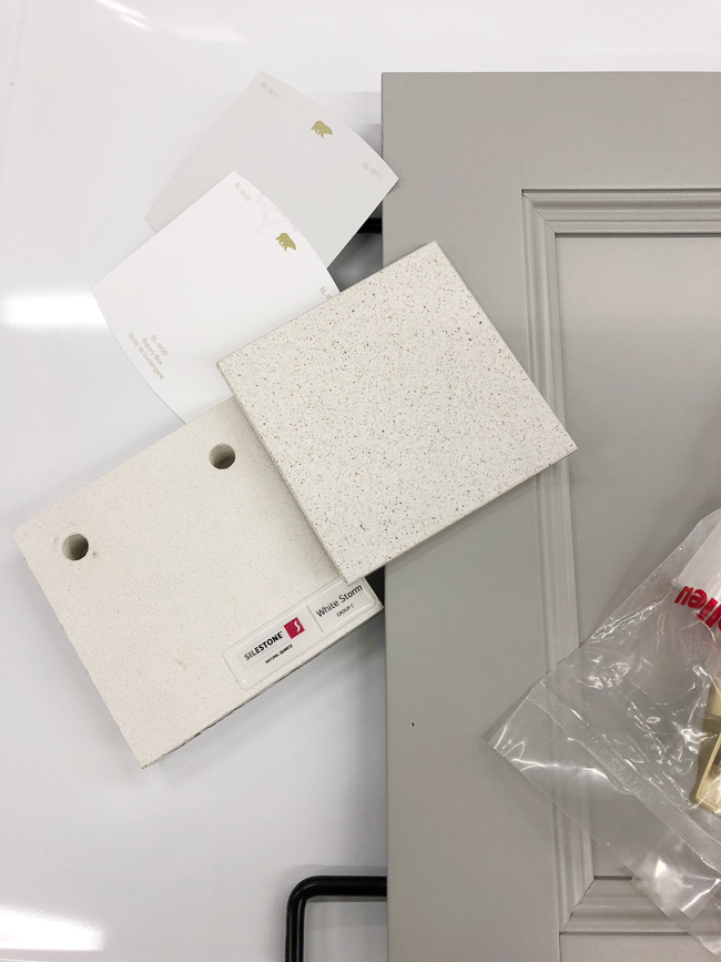
In case you missed my previous laundry room post, here is a photo of the cabinets, paint colours and also the counter tops.  I've selected a durable Silestone quartz counter top (ordered through Home Depot) in a beautiful white finish, White Storm to be exact (far left).  The room is on the small side, my hope is that the white counters will help make the room feel that much more spacious and brighter as they will reflect the light.


Okay, now for a progress shot!  Here's a peek at where we are now:


I've since painted the side of the uppers to match the door fronts as well as the melamine panel (which we cut to size) beside the washing machine (we made sure that we could open the base cabinet door beside the panel prior to installing).  I also ironed on a piece of veneer edging onto the front of the melamine (took no time at all!).  We now have to add the crown moulding to the upper cabinets, toe kicks to the base cabinets and install the floating shelves.

The counter tops are to be measured within the next week and should be installed in 3-4 weeks (the faucet and sink will installed at that time as well). 

The last detail that I have to share today is a progress shot of the faux relaxed roman shade that I'm making for the window.  There are already blinds on the window, which we want to keep for privacy, but I wanted to add a relaxed roman shade to soften up the space a touch.   Oh!  And I do have to make a decision about hardware, I keep going back and forth between finishes....


We are so so close to being finished this project and we couldn't be anymore thankful or excited!  This is the first time that we've ever had cabinetry in our laundry room, it's such a treat I tell you!  The room is already more organized than before, which is just amazing!

Check back soon as I'll be sharing the full reveal including before and afters!

Cheers,

****This post is sponsored by Blanco Canada and Home Depot.  All opinions are my own****
SaveSave
SaveSave

Adding a Cozy Layer to the Dining Room

Thursday, February 22, 2018

Hey guys!

So I've been dying to share today's post with you for some time!  About a week ago, a moment that I've been waiting for for what feels like forever finally happened and couldn't be any more excited!

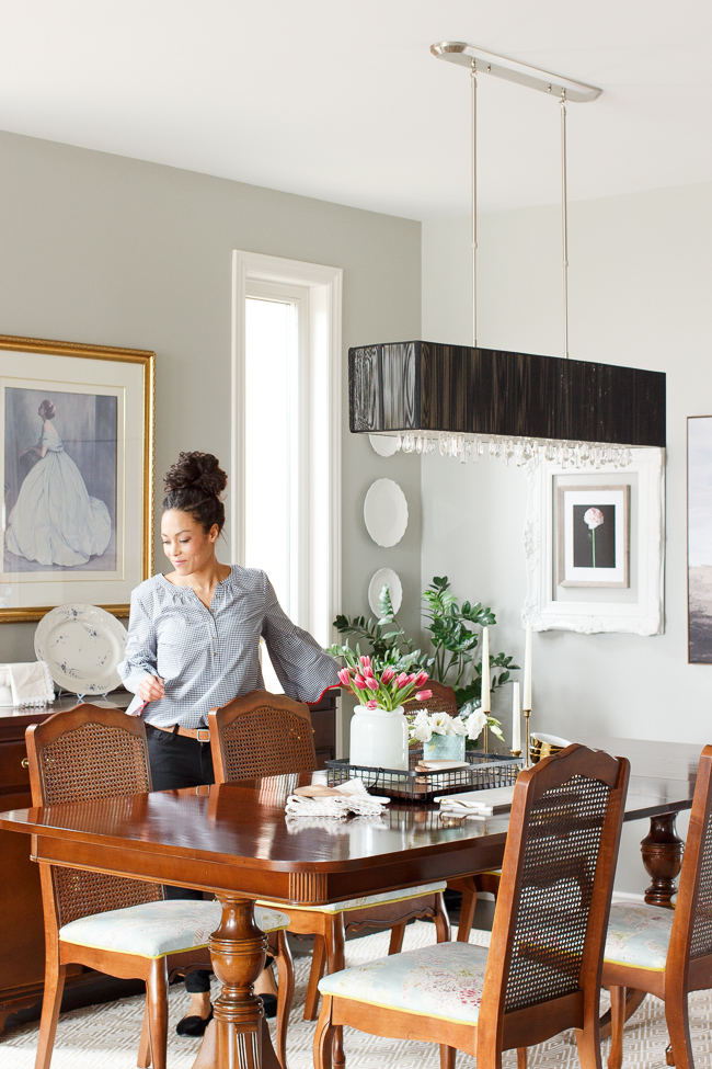
The long awaited moment....our rug for the dining room arrived!  I feel like this room has been screaming for a cozy layer and a more relaxed feel for years.  The dining room is open to the living room, so we see it all of the time.  For it to not feel as comfy and as inviting as the living room is something that has always kind of bugged me!  

This room also has a door that opens up to the kitchen, so I needed to ensure that I chose a rug that would work with the decor in both the living room and kitchen.

This stunning diamond rug by Annie Selke was the perfect solution.  We have an Annie Selke rug in our family room and just love it.  Not only for it's beautiful pattern, but also for how well it's made.

I had decided some time ago that a diamond rug would look absolutely amazing in space.  I felt that the geometric print would add interest and would also pair beautifully with the vintage pink in the living room.  After choosing the design, it was then a matter of selecting a colour (this particular rug comes in over 10 different colours!).  Since a neutral colour will do a good job of hiding anything that would fall during meal time, I decided to go with khaki & white.


To be totally honest, I had different tabs open on my computer with three different diamond printed rugs for what felt like forever!  The petite diamond rugdiamond indoor/outdoor rug and the natural sisal rug all felt like really great options!  Of course, I ultimately ended up going with the with the diamond indoor/outdoor rug in khaki and white (I love how the khaki was similar to sisal in colour), but the other options would have looked amazing, I'm sure! 

Here's a tip!  When selecting a rug for the dining room, you want to ensure that the rug is wide enough for you and your guests to push your chairs back and for the feet of the chairs to still be on the rug.  For the length, the rug should extend well past the end of the table, at least 6-8".  For this room we went with an 8.5' x 11' rug size.

I love that the rug not only adds a touch of comfort but it helps to tone down the more traditional elements and the formal feel of the room, which is amazing and exactly what I was hoping to achieve.  The new rug makes the room feel much bigger and brighter too, but most importantly, the room no longer feels cold or unwelcoming.

Cheers,

***This post is sponsored by Annie Selke.  All opinions are my own***

A Spring Kitchen Refresh!

Tuesday, February 20, 2018


Hi hi!

I hope everyone enjoyed the most wonderful long weekend!

I'm so thrilled to share a kitchen update that has been on my wish list for a few years now.  I can't lie, I have some big plans for our kitchen!  After living here for just over five years, we now have a good feel for what isn't working and where we can make some minor changes that will have a big impact.

We took the first step in the right direction after I spotted a pair of gorgeous stools at an incredible price at one of my favourite stores, HomeSense!  The stools featured a stunning wooden seat and gorgeous black metal legs and well, I immediately brought them home (no HomeSense regret this time!).  Though there wasn't exactly anything wrong with the white stools that we had at the peninsula, what wasn't working was their large footprint.  They really reduced the amount of space that we had between the back of the stools and the chairs at the kitchen table.  Finding stools that were slightly narrower was the answer.

Once in place, I knew that the new stools were the perfect solution to the problem!  I was able to find another pair at a HomeSense store in Ottawa and you guys, just like that, our kitchen has a fresh look!


I find that not only do they provide us with more walk through space, but they also add warmth and are more inviting.

The new stools may have prompted a kitchen refresh adding touches of colour and warm textures, perhaps in an attempted to channel spring!

Pretty pastel coloured ceramics pair so incredibly beautifully with white stone or wooden accents,  I absolute how incredible affordable these pieces always are at HomeSense.  Marble adds a touch of glamour to every day kitchen accessories.  Layering cutting boards of various sizes, adds visual interest and can be done so easily thanks to the selection and great value at HomeSense!  It's the little things!


It always amazes me how a small change can have such a huge impact on a space!

Wishing you a beautiful day!

Cheers,

***This post is sponsored by HomeSense, all opinions are my own***
SaveSave

Family Room Makeover with Structube

Monday, February 5, 2018


Hi everyone!

I hope that February is off to a great start for you!  I've been working away behind the scenes, continuing to update a few rooms in our house (this year it's all about getting those projects that I've been dreaming of done!).

One of the rooms that has been needing further updates is the family room.  We painted the walls and added trim last year, but what really needed to be replaced was the sofa.  It had definitely seen better days (that's putting it nicely!) and to be honest, it didn't suit our style nor did I find it to be as cozy as it once was.

So our search for a new sofa began!  After narrowing down styles, we decided that we wanted a classic style.  Our top two style choices were the chesterfield and english roll arm.  We also knew that we didn't want any cushions on the back of the couch.  Since this is the room where we like to cozy up to watch tv, we decided that the chesterfield would in fact be the best choice as it has a great arm height.

Our search brought us to Structube, a Canadian company who prides themselves in offering stunning products at affordable prices.  After a few minutes of looking on their site, we found the one!!!  Our new sofa arrived perfectly packaged last week and today, I'm sharing all of the details!

Without further ado, here is the beautiful new sofa!


There were three colour options,  I decided to go with the a lighter colour as I really wanted to brighten the space and make it feel airer.  The all-round lower height of the sofa also helps with this.

What I love about this sofa is the attention to detail (hello tufting and rolled arms) as well as the over-filled cushions (which have velcro on the underside to help keep them in place!).  The carved wooden feet are the perfect shape and colour!


This room went from feeling dark and heavy to airy and bright and I am just so in love with the new look!  I have to be honest, I can't even tell you the last time that I curled up on the couch in this room...I usually always sit in one of the chairs.  But since this sofa arrived, I've been cozying up on it daily!  I love how you can comfortably place your arm along the back or the sides.

This entire experience was a very good example of the importance of choosing the perfect sofa for the room's needs.  The Ashford sofa is longer than our previous couch, so three of us can sit comfortably on it and ultimately, this room was screaming for a comfortable couch.  I'm so thankful that we found the perfect fit!


***This post has been sponsored Structube.  As always, all opinions are my own.  Many thanks for supporting brands that I adore****
 

© 2010-2014 Julie Shaver. All Rights Reserved. | Policies | Blog Design By Brittany Douglas